Designing Your Product: The sweet spot of lifetime value.
 Sat, December 16, 2006 at 7:27 PM in
  Startups
 The Sweet Spot for Buying
Some people love the charts and graphs. They're helpful in thinking about the business you're in and how you're going to design your product offerings. I actually use a number of these same thoughts in designing medical service businesses and teach them to doctors (who also love to cram in the kitchen sink). I would guess that the actual sweet spot moves over time.
Via: LukeW
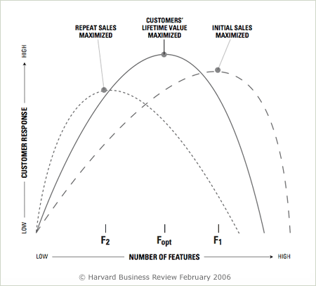
In response to my Sweet Spot on the Curve article, Klaus Kaasgaard, Yahoo! Director of User Experience Research, pointed me toward a Harvard Business Review article titled Defeating Feature Fatigue that highlighted some additional considerations for determining the feature curve sweet spot. To paraphrase Klaus:
“Before using a product, people will judge its desirability and quality based on ‘what it does’ (i.e. the number of features). Even though they may be aware that usability is likely to suffer, they will mostly choose products with many features. After having used these products however, usability will start to matter more than features and people will choose easy-to-use products over products with many features. The dilemma is that in order to maximize initial sales one needs to build products with many features, products that do lots of “stuff”. But in order to maximize repeat sales, customer satisfaction and retention one needs to prioritize ease-of-use over features.”
Barry Schwartz echoed this situation in his talk at User Interface 11 when he articulated the capability vs. usability tension inherent in decision-making. In a test Barry referenced, participants preferred to have CD players with 21 features to ones with 7. But if they first used the 21-feature player for a while, they preferred the 7-feature one.


Reader Comments (1)
http://www.shmula.com/158/focus-on-the-customer